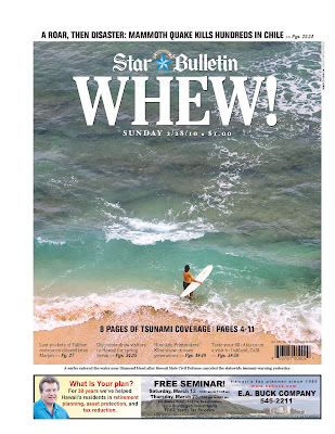
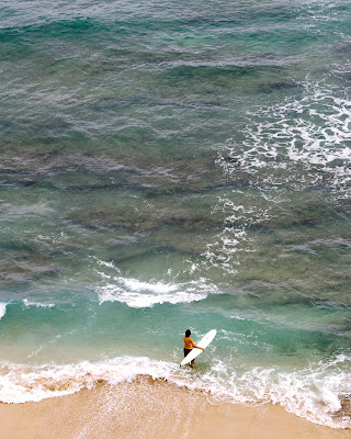
Just a quick post to show the actual page that ran on Sunday along with the original file I sent to AP. Nice use of space and text with the image. The page designers used the empty space well and anchored the rest of the paper on the bottom in the sand.
Did I preconceive this shot before hand thinking of a layout or page use? Not really but I did have an idea of what I wanted to illustrate. As I said in my last post, I wanted to convey the idea of Hawaii getting back to normal after the tsunami warning was rescinded. The use of the empty space, the whitewash pointing at the surfer, the board shape, the shape of the surfer, the color of the sand…it all works. I would have never guessed this image worked the way it did however; harking back on that subconsciousness of photography, it worked well.

