Not very long after I wrote my post, ca 1990, I had various responses from friends commenting on the mental eye while another snickered about my decisive moment and those who just have no clue. After reading my post, Jordan Murph emailed me exclaiming it is “proof that pictures come from the inside”. His words moved me as did his belief in photography and how he understood the meaning of my simple line drawing from years ago. His statement gave me lots of encouragement to continue in my chaotic world of “visual storytelling” and using my eyes as my language. Again, I do not wish to portray myself as some deep artist but I do feel a slight pull of the subconscious in my images.
After having lost track of each other for close to a decade, a close friend discovered my website and claimed in her email “you’re not really a photographer…you’re still a writer…” I once sent her many letters from my travels abroad describing the visual, verbally. I only wish I had copies of those letters as they would help me understand and harness my creativity. I was a better writer then than a photographer. It took years of apprenticeship in New York to help me fully understand the visual of my world. If you have those letters, please send them back.
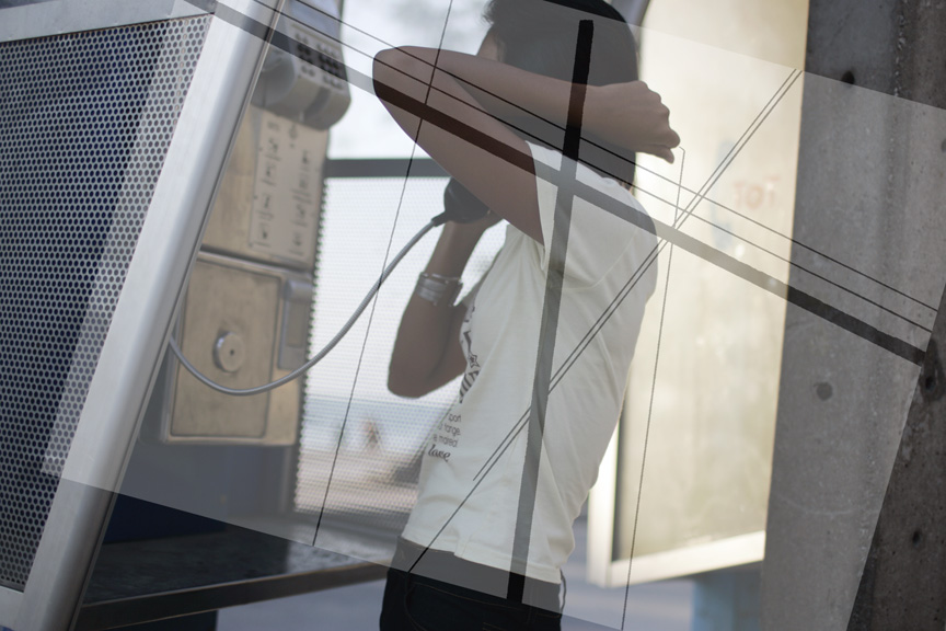
As I stumbled into my photographic archive and found an image with nothing striking about it on the surface. I snapped this picture of a girl on the phone in Pattaya, Thailand in the early 2004 as I waited to enter Banda Aceh, Indonesia, ground zero of the Asian tsunami which devastated…well…the globe. The photo reminded me of the unbearable pressure before entering a world I was unfamiliar.
Wandering the seedy Thai town, its hard to stay focused as so much is happening around you. I found myself drawn to this girl. I snapped all of three pictures of her but didn’t understand why I aimed my camera at her. You don’t see her face, there is nothing particularly exciting about the image other than her body language and the elements around her but the moment felt right. Maybe its the fact you can’t see her. She is sexually ambiguous, her body not clearly telling us if she’s a woman or an adult, her chopped haircut, her boyish attire. Triangles jut from the from the phone booth in front and behind, her elbows thrust and mimic her surrounding. Squares and circles define her presence, bokeh fills her background. But in reality it is just a girl on the phone pushing her hair down on her neck. But as I looked at the picture, I recalled Jordan’s words, I saw my drawing and understood why the images stands out to me.
There are clearly art and design fundamentals that appear in our everyday world. The fundamentals never disappear. I love this commercial for squarespace web design as the creators clearly create design art throughout the entire the ad. Almost every shape, movement, and line visually pushes the viewer into the center negative space which fills with text, or the main message of the ad. As commercial art goes, its beautiful. the lighting, the set design, the props are perfect. As art and design, it is wonderful.
It clearly reflects the aesthetic of photographer Garry Perweiler, who wrote a wonder book on still life designed in the 80’s. As dated as his imagery is, the art design is no different than this ad for squarespace, just modernized. Again, everything falls back on the fundamentals.
I must admit and I have many times over the years, I feel no difference from a xerox machine as sometimes I just push the button to copy what’s in front of me. However there are those images that once I go back and discover them, remained linked to the fundamentals of photographer Garry Perweiler, the squarespace designers, Avedon, Da Vinci, and all and all those before and after. Like language, the rules of art don’t change. You still need a subject, adjective, and verb and like art, you will always need a line directing the viewer, some negative space, and a little bit of weight to balance it all out.


